 Options Wheel Trader
A Fresh Look for Options Wheel Trader: Site and App
July 31, 2026
Introduction
Options Wheel Trader has grown a lot since the early days of “replace the spreadsheet.” The site and the app needed a look and story that match what the product does today. This post walks through what we refreshed, why we did it, and how to get the most out of both the public website and the signed-in experience. No technical deep dive, just what’s new and how to use it.
Why we refreshed
Most people still discover the product the same way: they are tired of tracking puts, calls, assignments, and rolls in a spreadsheet. That story is still true. What has changed is everything around it.
Today you can plan which open trades need attention, scan for wheel-friendly candidates, track positions across accounts, and analyze what actually worked. The website was still telling a narrower story, and the app’s look had not kept up with how dense and day-to-day the workflow had become.
So we refreshed both surfaces:
- The website, so visitors can see the full platform clearly and find the right page without hunting.
- The app, so the screens you use every day feel clearer, more consistent, and easier to make your own with light, dark, and accent themes.
The website: a clearer story and easier navigation
What’s new
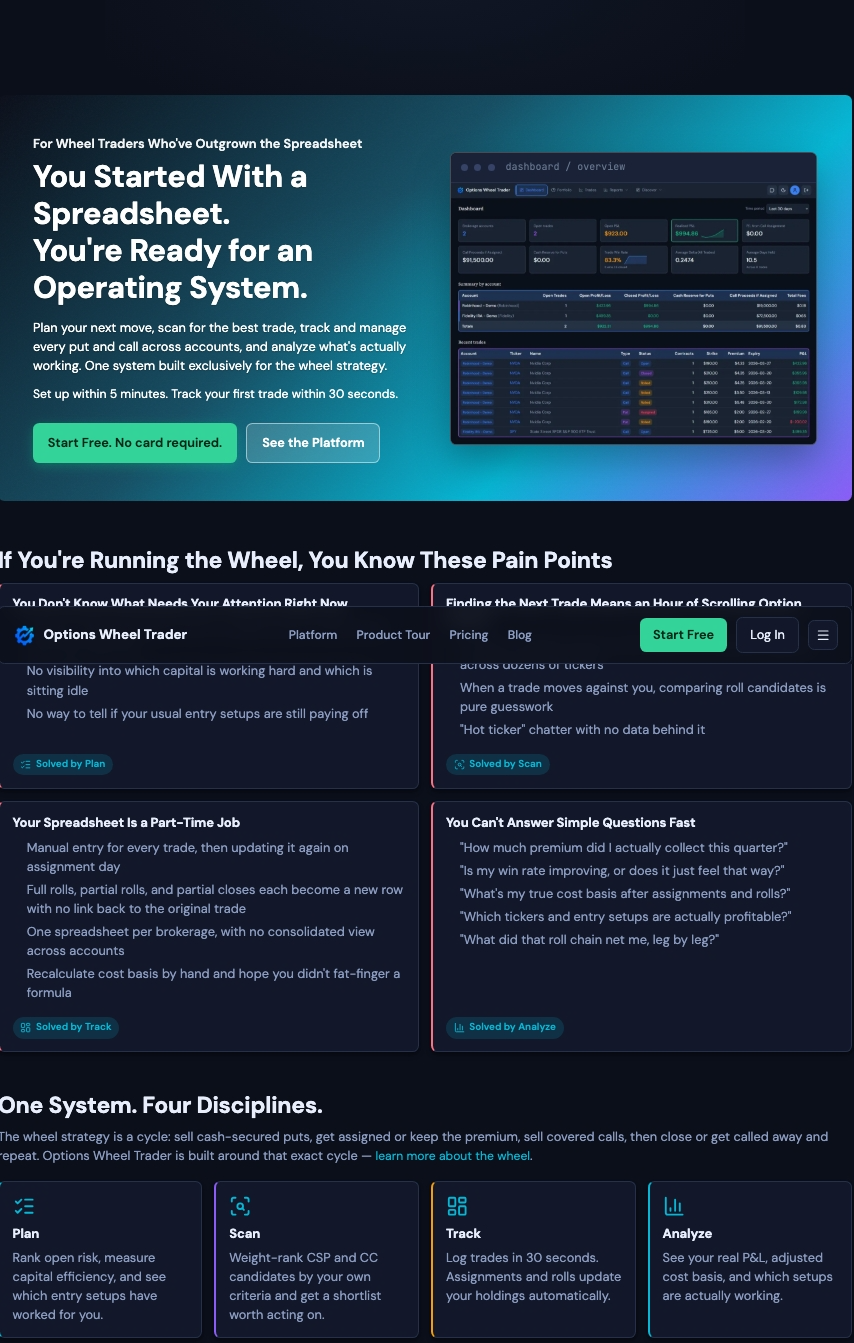
The site now frames Options Wheel Trader as the operating system for the wheel strategy: one place to Plan, Scan, Track, and Analyze. That is not a slogan for its own sake. It matches how the product is actually organized.
You will also find dedicated pages that used to be buried in a long home page or missing entirely:
- Platform: a deeper look at Plan, Scan, Track, and Analyze, and what sits under each.
- About: the founder story, why we built this, and how we think about trust and privacy.
- FAQ: the full set of common questions in one place.
- Contact: a proper page when you want to reach us.
Home, Pricing, and Product Tour are still there. Home is shorter and points you into the rest of the site. Pricing still has the same Starter, Active, and Pro plans. Product Tour remains the screenshot walkthrough of the real UI.
Across public pages you get a fuller header on desktop and a shared footer with Product, Company, and Legal links, so moving around the site feels intentional instead of improvised.
How to use it
A simple path if you are new or returning after a while:
- Start on the home page for the short story and the four pillars.
- Open Platform when you want the “what can this do?” depth, organized by Plan / Scan / Track / Analyze.
- Open Product Tour when you want to see the screens themselves.
- Use Pricing to compare plans, FAQ for practical questions, About for the story behind the product, and Contact if you want to get in touch.
If you already know what you need, the header and footer get you there in one click.
The app: denser screens and themes you can choose
What’s new
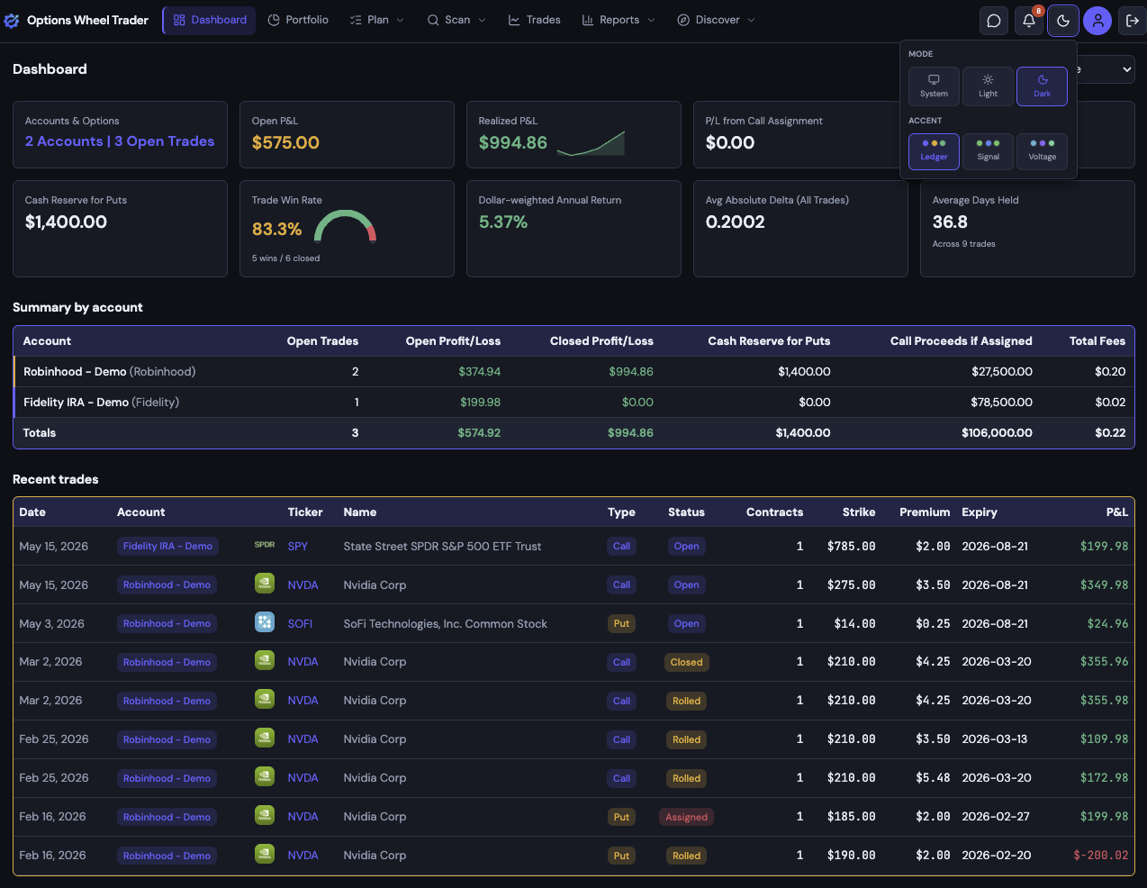
Inside the signed-in app, the refresh is about clarity and consistency. Trades, portfolio, reports, discover, settings, and related screens share a tighter visual language so tables, panels, and dialogs feel like one product instead of a patchwork of styles.
You can also choose how the app looks:
- Color mode: Light, Dark, or System (follow your device).
- Accent theme:
- Ledger: balanced default with a blue-violet accent.
- Signal: greener, more terminal-leaning look with less color noise.
- Voltage: brighter cyan primary with violet highlights.
Profit and loss still read as green and red in every theme. The accent changes the “personality” of buttons, links, and highlights without changing how you read P&L.
How to use it
Two ways to set appearance:
- Quick change from the header. Use the Appearance control in the app shell to flip color mode or accent without leaving the page you are on.
- Full picker in Settings. Open Settings, go to the Appearance section, and choose color mode and accent theme with a live preview. Your choice follows your account, so the same look shows up when you sign in elsewhere.
Pick the combination that feels easiest to stare at during a long session. There is no wrong answer; Ledger is the default if you prefer not to decide.
What did not change
This refresh is about look, layout clarity, and navigation. Your trades, portfolio, reports, plans, and account data work the same way. We did not rename the product or invent new strategy features under the cover of a redesign.
Try it
- Browse the refreshed site at optionswheeltrader.com, starting with Platform if you want the full picture.
- If you already have an account, sign in and try Appearance in the header or under Settings.
- New here? Start free. No card required.
We hope the site makes the platform easier to understand, and the app makes your daily wheel workflow a little clearer and more comfortable. If something feels off, or you have a theme preference we should consider next, tell us.